DayPilot
| Demo | |
|---|---|
| Downloads | |
| Repository | |
| Languages | TypeScript |
| Technologies | angular |
Features
-
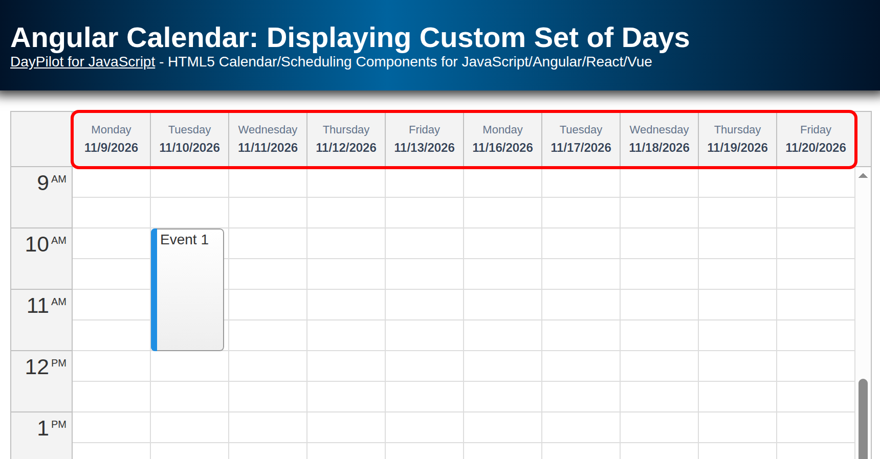
The Angular Calendar component from DayPilot for JavaScript can display a custom set of days using manually defined columns. This example uses the open-source DayPilot Lite edition.
-
Instead of an automatically generated week, the calendar will display two work weeks (without weekends).
-
You can use this approach to show a calendar with any combination of days (e.g. Monday-Wednesday-Friday).
-
This Angular 22 project was generated using Calendar UI Builder.
License
The sample project uses DayPilot Lite for JavaScript, available under the Apache License 2.0. See the licensing information included in the download for details about third-party libraries.
Angular Calendar Component Configuration
The calendar config signal switches the calendar component to the resources view:
config = signal<DayPilot.CalendarConfig>({
  // ...
  viewType: "Resources",
  columns: this.columns,
  // ...
});
In this mode we can generate the columns manually using a columns getter. This generator starts on Monday of the current week and adds work days to the array:
get columns(): DayPilot.CalendarColumnData[] {
  const result: DayPilot.CalendarColumnData[] = [];
  const first = DayPilot.Date.today().firstDayOfWeek(1);

  for (let i = 0; i < 14; i++) {
    const day = first.addDays(i);
    const dayOfWeek = day.getDayOfWeek();

    // skip weekends
    if (dayOfWeek === 0 || dayOfWeek === 6) {
      continue;
    }
    result.push({start: day, name: day.toString("ddd M/d/yyyy")});
  }
  return result;
}
The loop covers fourteen calendar days. It skips Sunday (0) and Saturday (6), leaving ten columns. Each column uses start for its date and name for the visible header. The dates jump from Friday to Monday without leaving empty weekend columns. To display Monday-Wednesday-Friday only, change the filter to keep weekday numbers 1, 3 and 5.
With ten columns sharing the available width, the onBeforeHeaderRender handler displays the weekday above the date in a 54-pixel header. The header styles in src/styles.css center both lines and distinguish the weekday from the complete date. These styles are global so they apply to the markup generated by the calendar.
Source Code
This is the source code of a standalone Angular calendar component that displays a custom number of days as columns. The DayPilot Angular wrapper accepts the config and events signals directly; after the simulated data request completes, events.set(result) displays the loaded events.
src/app/calendar/calendar.component.ts
import {Component, ViewChild, AfterViewInit, signal} from "@angular/core";
import {DayPilot, DayPilotModule, DayPilotCalendarComponent} from "@daypilot/daypilot-lite-angular";
import {DataService} from "./data.service";

@Component({
  selector: 'calendar-component',
  standalone: true,
  imports: [DayPilotModule],
  providers: [DataService],
  template: `<daypilot-calendar [config]="config" [events]="events" #calendar></daypilot-calendar>`,
  styles: [``]
})
export class CalendarComponent implements AfterViewInit {

  @ViewChild("calendar")
  calendar!: DayPilotCalendarComponent;

  events = signal<DayPilot.EventData[]>([]);

  config = signal<DayPilot.CalendarConfig>({
    eventClickHandling: "Disabled",
    eventMoveHandling: "Update",
    eventResizeHandling: "Update",
    onTimeRangeSelected: (async (args) => {
      const modal = await DayPilot.Modal.prompt("Create a new event:", "Event 1");
      const calendar = args.control;
      calendar.clearSelection();
      if (modal.canceled) {
          return;
      }
      calendar.events.add({
          start: args.start,
          end: args.end,
          id: DayPilot.guid(),
          text: modal.result
      });
    }),
    timeRangeSelectedHandling: "Enabled",
    viewType: "Resources",
    columns: this.columns,
    headerTextWrappingEnabled: true,
    headerHeight: 54,
    onBeforeHeaderRender: args => {
      const day = args.header.start;
      args.header.html = `<div class="custom-day-header">
        <span class="custom-day-weekday">${day.toString("dddd")}</span>
        <span class="custom-day-date">${day.toString("M/d/yyyy")}</span>
      </div>`;
      args.header.toolTip = day.toString("dddd, MMMM d, yyyy");
    },
  });

  constructor(private ds: DataService) {
  }

  get columns(): DayPilot.CalendarColumnData[] {
    const result: DayPilot.CalendarColumnData[] = [];
    const first = DayPilot.Date.today().firstDayOfWeek(1);

    for (let i = 0; i < 14; i++) {
      const day = first.addDays(i);
      const dayOfWeek = day.getDayOfWeek();

      // skip weekends
      if (dayOfWeek === 0 || dayOfWeek === 6) {
        continue;
      }
      result.push({start: day, name: day.toString("ddd M/d/yyyy")});
    }
    return result;
  }

  ngAfterViewInit(): void {
    const from = this.calendar.control.visibleStart();
    const to = this.calendar.control.visibleEnd();
    this.ds.getEvents(from, to).subscribe(result => {
      this.events.set(result);
    });
  }

}
Select an empty time range to create an event using the prompt. Canceling leaves the event list unchanged. The data service supplies one event on Tuesday of the current week; events created or moved in the calendar are held in memory and are lost when the page reloads.